Why We Use MUI

A little history
As you've read in our previous Summer Health Dev Blog post, Summer Health is an early-stage start-up whose goal is to simplify healthcare and provide better access to doctors for patients. When we first started building our applications last summer our main focus was to move quickly while building a base for the future. At first, tailwind seemed like the right choice. If offered us a simple CSS utility interface to build out pages quickly and easily. In addition, there are several sites with well-documented tailwind recipes we were able to lean on. However, as time passed, we started to encounter issues with relying upon tailwind alone.
Why we re-evaluated
As we continued to build, we began to notice a few issues. First, the pages of our site began to drift in design. On some pages, we began to notice small inconsistencies in spacing and layout between sections of content. We began building components to manage page sections but we wondered if there was a better way. The second, and more compelling reason we decided to re-evaluate, although there are component libraries that are built on tailwind (and we tried a few), we realized to move more quickly and consistently we need an extensive component library we can easily theme. After evaluating several options, MUI was the standout winner.
Choosing MUI
If you haven't heard of MUI. MUI is a comprehensive and free react component library system that is built on the philosophy of Google Material Design. Their documentation is extensive and they offer demos with code examples in their documentation to help you learn how to customize. Speaking of customization, their theming system allows you to build your variants into the main theme system so that we can build consistency across the application; while also offering a simple way of doing overrides. One of the big plusses of going with MUI was its usage of Google Material Design; although MUI does deviate from Material Design they are working towards consistency in the future. It allowed us to build a common language between our engineering team and the design team. Which we've used to create our applications MUI theme.
Setting up our theme system
At Summer Health we use nx to manage our applications codebase.
To help make our design and component system accessible to various applications we
created a ui library to house our theme and components. Below I'll lay out how
we intergraded our color system into our MUI theme.
Our designers take advantage of Figma for building our designs. Material design, like many popular design systems, offers a figma design kit we were able to take advantage of color and theme our components.
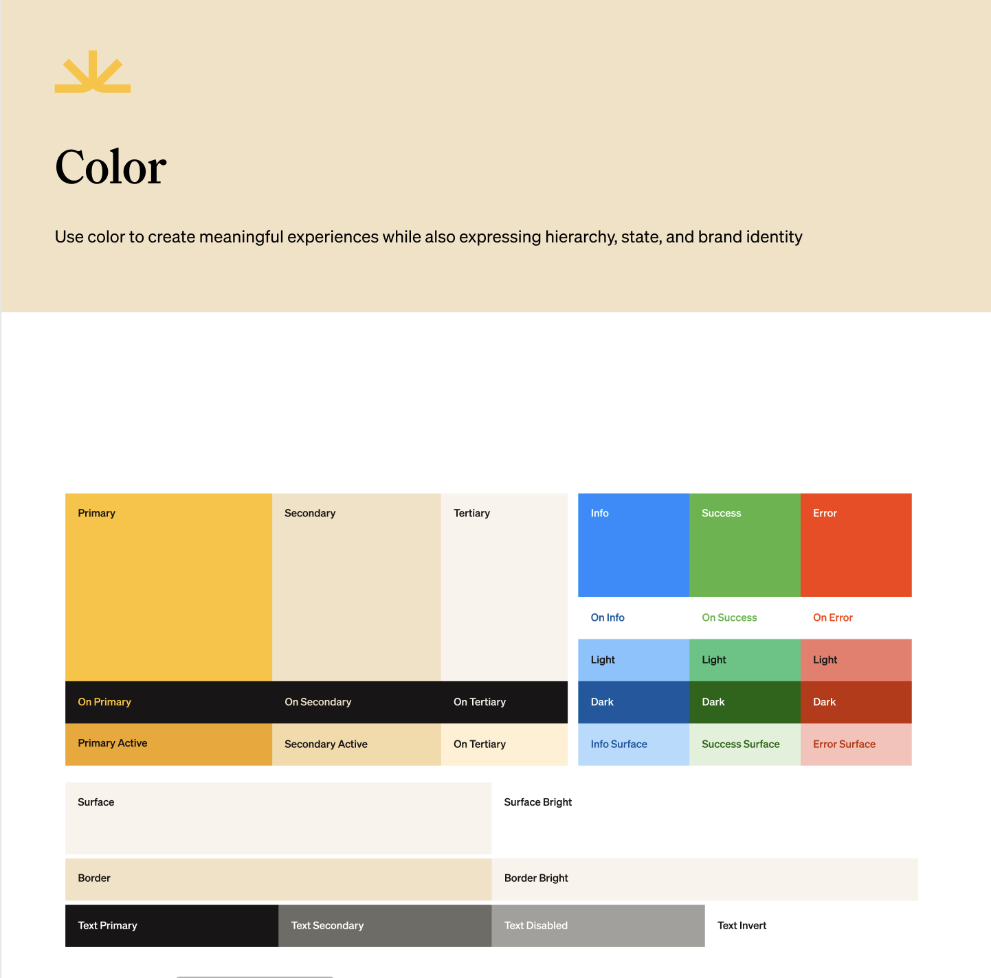
With it, we created a trimmed-down version based on our application needs with an easy ability to expand.
From here we were able to translate those colors into our MUI theme. Below is a snippet of our color theme.
import { experimental_extendTheme as extendTheme } from '@mui/material/styles';

export const theme = extendTheme({
  // other customizations...
  sunrise: {
    light: {
      primary: {
        main: '#FFC220',
        onMain: '#171515',
        active: '#FBB805',
        onActive: '#171515',
        focus: '#FFC220',
        onFocus: '#171515',
        focusBorder: '#F2A612',
        disabled: '#F2E2C4',
        onDisabled: '#171515',
      },
      secondary: {
        main: '#F2E2C4',
        onMain: '#171515',
        active: '#F5DAA7',
        onActive: '#171515',
        focus: '#F5DAA7',
        onFocus: '#171515',
        focusBorder: '#F2E2C4',
        disabled: '#F2E2C4',
        onDisabled: '#171515',
      },
      // other color palette options...
    },
  },
});
Now that our color system has been set up we can then translate that into our components.
Below is an example of how we translated our color scheme into our button components.
export const theme = extendTheme({
  // other customizations...
  components: {
    MuiButton: {
      defaultProps: {
        disableElevation: true,
      },
      styleOverrides: {
        root: ({ theme, ownerState }) => ({
          ...TypographySunrise['label.medium'],
          backgroundColor: `var(--mui-sunrise-${theme.palette.mode}-${ownerState.color}-main)`,
          color: `var(--mui-sunrise-${theme.palette.mode}-${ownerState.color}-onMain)`,
          border: `2px solid var(--mui-sunrise-${theme.palette.mode}-${ownerState.color}-main)`,
          ':hover': {
            backgroundColor: `var(--mui-sunrise-${theme.palette.mode}-${ownerState.color}-active)`,
            color: `var(--mui-sunrise-${theme.palette.mode}-${ownerState.color}-onActive)`,
            border: `2px solid var(--mui-sunrise-${theme.palette.mode}-${ownerState.color}-active)`,
          },
          ':focus': {
            backgroundColor: `var(--mui-sunrise-${theme.palette.mode}-${ownerState.color}-focus)`,
            color: `var(--mui-sunrise-${theme.palette.mode}-${ownerState.color}-onFocus)`,
            border: `2px solid var(--mui-sunrise-${theme.palette.mode}-${ownerState.color}-focusBorder)`,
          },
          ':disabled': {
            backgroundColor: `var(--mui-sunrise-${theme.palette.mode}-${ownerState.color}-disabled)`,
            color: alpha(
              theme.sunrise[theme.palette.mode][ownerState.color].onFocus,
              0.38,
            ),
            border: `2px solid var(--mui-sunrise-${theme.palette.mode}-${ownerState.color}-disabled)`,
          },
        }),
      },
    },
    // other customizations...
});
Documentation
With our themes and components configured, we needed a way to share that with our engineers and our designers. In comes Storybook for the assist! Storybook As their website states; Storybook offers developers a way of building UI components in isolation and while doing so provides a way to build documentation. We'll be talking more about how we build components, and take advantage of Storybook, in a future blog post.
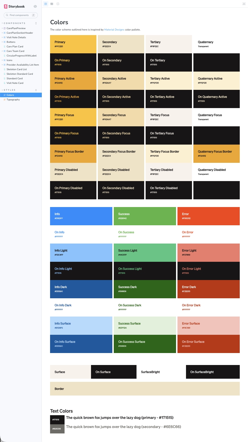
Thanks to Storybook we have been able to provide a story sharing our color styles and their definition with our cross-functional team.
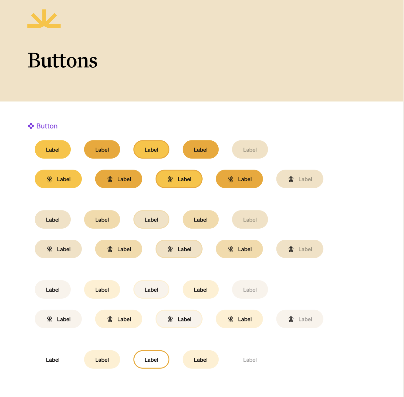
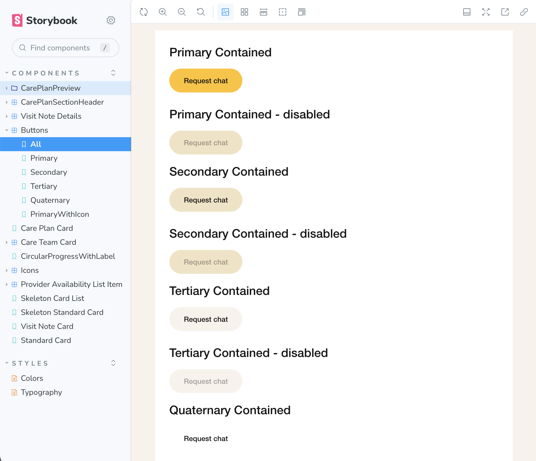
We are also able to showcase our various button variants.
Wrapping up
Tailwind has been growing in popularity and can offer engineering teams a way of quickly building out scalable efficient pages. However, MUI offers a highly customizable theming system to build consistent layouts with an extensive library of prebuilt components that have allowed us to build our latest features quickly and consistently.